Building a new football stadium is no easy task. It usually starts with an ambitious chairman enthusiastically announcing the plans, but all too often ends in frustration and sometimes resignation. Though in the end most stadium proposals manage to overcome resistance and bureaucracy and turn into tangible concrete structures.
However, during all these years of procedures and presentations plans change. Usually, soon after the initial announcement a series of renders are presented. Often just a draft, but at some point more concrete images appear. These will then get shown with every article dedicated to another setback, but then, when things start to get concrete and final approval is imminent, the club starts to review things again, costs need to get cut, a new architect is hired (or a contest is launched), and a final design is chosen.
This final design can be somewhat, or can be completely different from initial sketches. We have taken a dive into our archives and looked up some of these old renders, and then put them together with the end result. You can see the result below.
Let’s start with one of the Euro 2012 stadiums, that is, Warsaw’s National Stadium. The first set of renders was current at around 2007. Green was the colour of choice, but more importantly the stadium consisted of three tiers and had a distinctly different exterior.
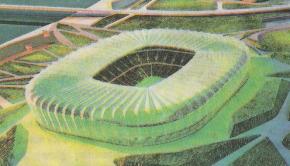 | 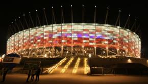 |
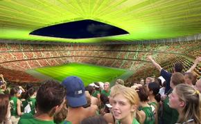 | 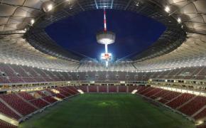 |
Next, we’ve got the Aviva Stadium, or what was previously called Lansdowne Road. The first render had a more symmetrical design, whereas later was chosen for a curvilinear shape with one of the stands behind the goal significantly lowered to allow for sufficient sunlight for the adjacent housing.
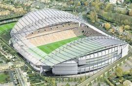 | 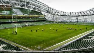 |
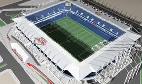
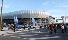
Then the Red Bull Arena, the one of the New York Red Bulls. The two renders are actually from different periods. The first, when the Red Bulls were still called the MetroStars, was a stadium modelled on Chicago’s Toyota Park. Then Austrian company Red Bull took over the club and wanted a more European-style stadium. The interior of the second render already resembled the final result, but in the end further changes were made to the exterior of the stadium.
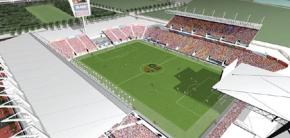 | 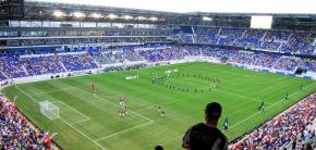 |
 |  |
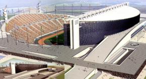
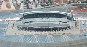
Possibly not one with massive differences, but still notable, is the Atatürk Olimpiyat Stadi. There are some small touches at the main stand that are different, but the opposing stand is a lot smaller and has received a cover in comparison with the render.
 |  |
Espanyol’s first renders also show clear similarities with the later Estadi Cornellà-El Prat. The two tiers and shape of the stands look already very similar, but the final stadium has received full cover, and most of the circular shapes have been changed for rectangular ones.
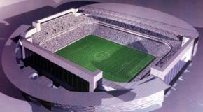 | 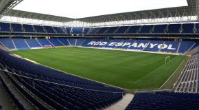 |
Then there are the first designs of Groningen’s Stadion Euroborg, which included “fingers” waving to the city and a retractable roof. A need to reduce costs eventually led to a more conventional design.
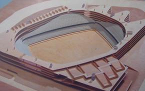 | 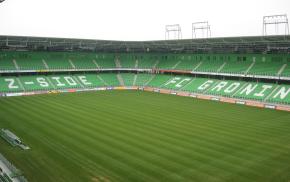 |
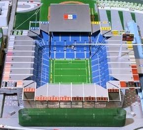
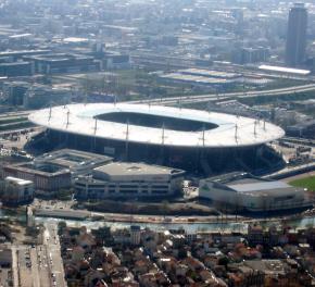
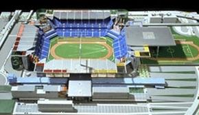
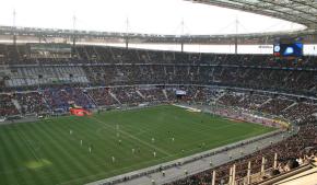
The next one falls into the category spectacular. This is the Stade de France that could have been. It was one of the two finalists in the design contest and designed by renowned French architect Jean Nouvel. It had a flexible structure, through which the stadium could quickly be converted from a football ground, to an athletics stadium, or and indoor arena.
 |  |
 |  |
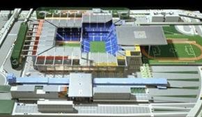 |
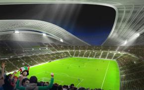
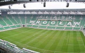
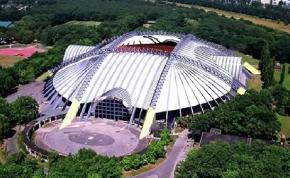
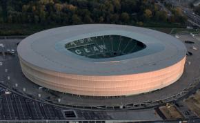
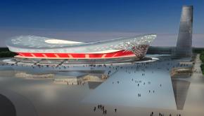
And finally back to Poland for another of the Euro 2012 stadiums, Stadion Miejski w Wrocławiu. Several designs had been floated before they settled on the final one. Here are three of them:
 |  |
 |  |
 |
There is much more where this came from and we’ll soon present you some past renders of stadiums currently under construction, and of some stadiums that never got built.
Some credits for the above photos: Warsaw National Stadium (1) © Mateusz Włodarczyk, Warsaw National Stadium (2) © Narodowy Centrum Sportu, Aviva Stadium © William Murphy, Red Bull Arena (both) © Paul Lowry, Atatürk Olimpiyat Stadi © Bjørn Christian Tørrissen, Estadi Cornellà-El Prat © José Porras, Euroborg © Kevster, Stade de France (1) © Pontauxchats, Stade de France (2) © Julien Haler, Stadion Miejski (1) © Lulek89, Stadion Miejski (2) © Łukasz Czyżykowski.